∗
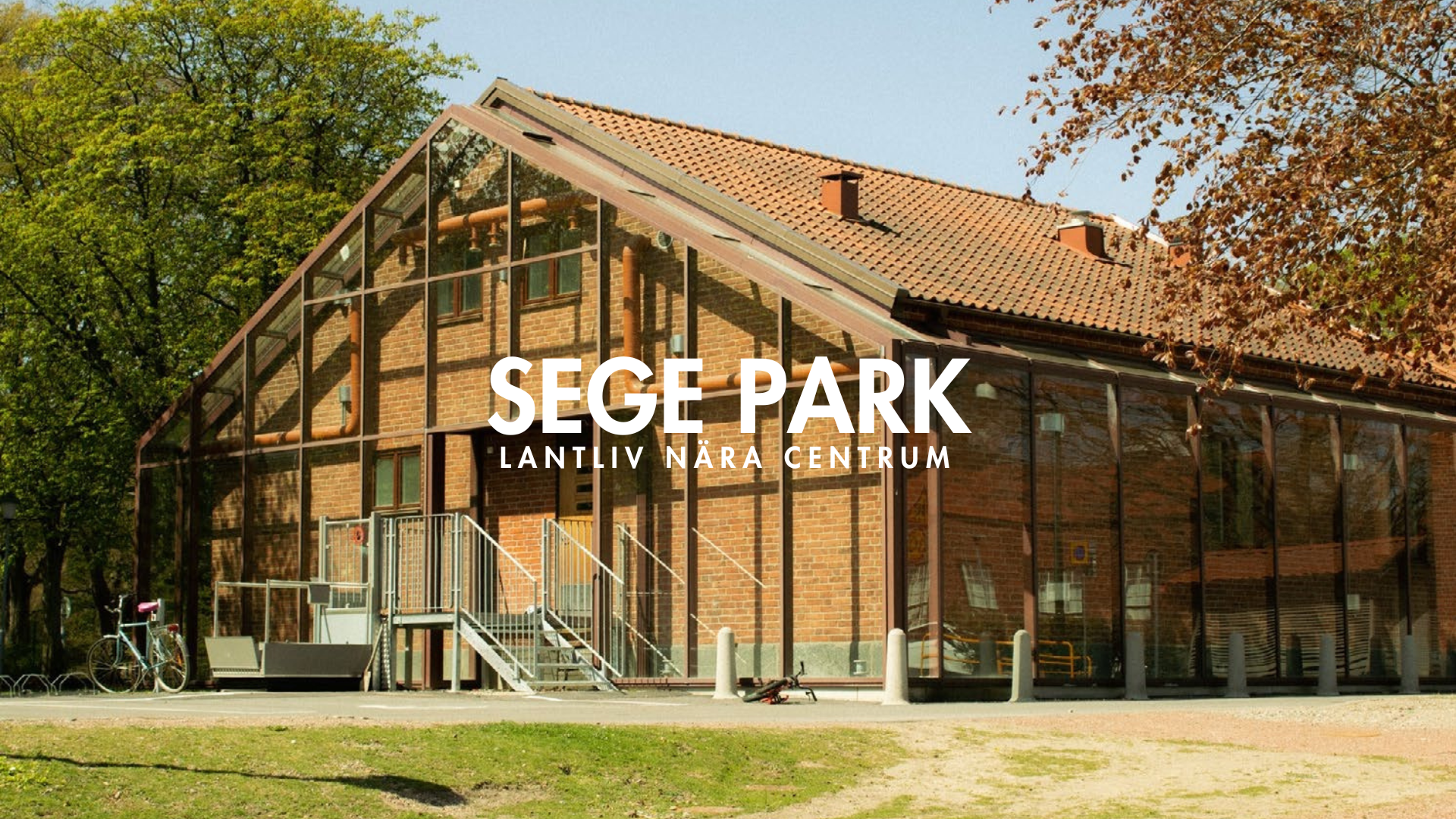
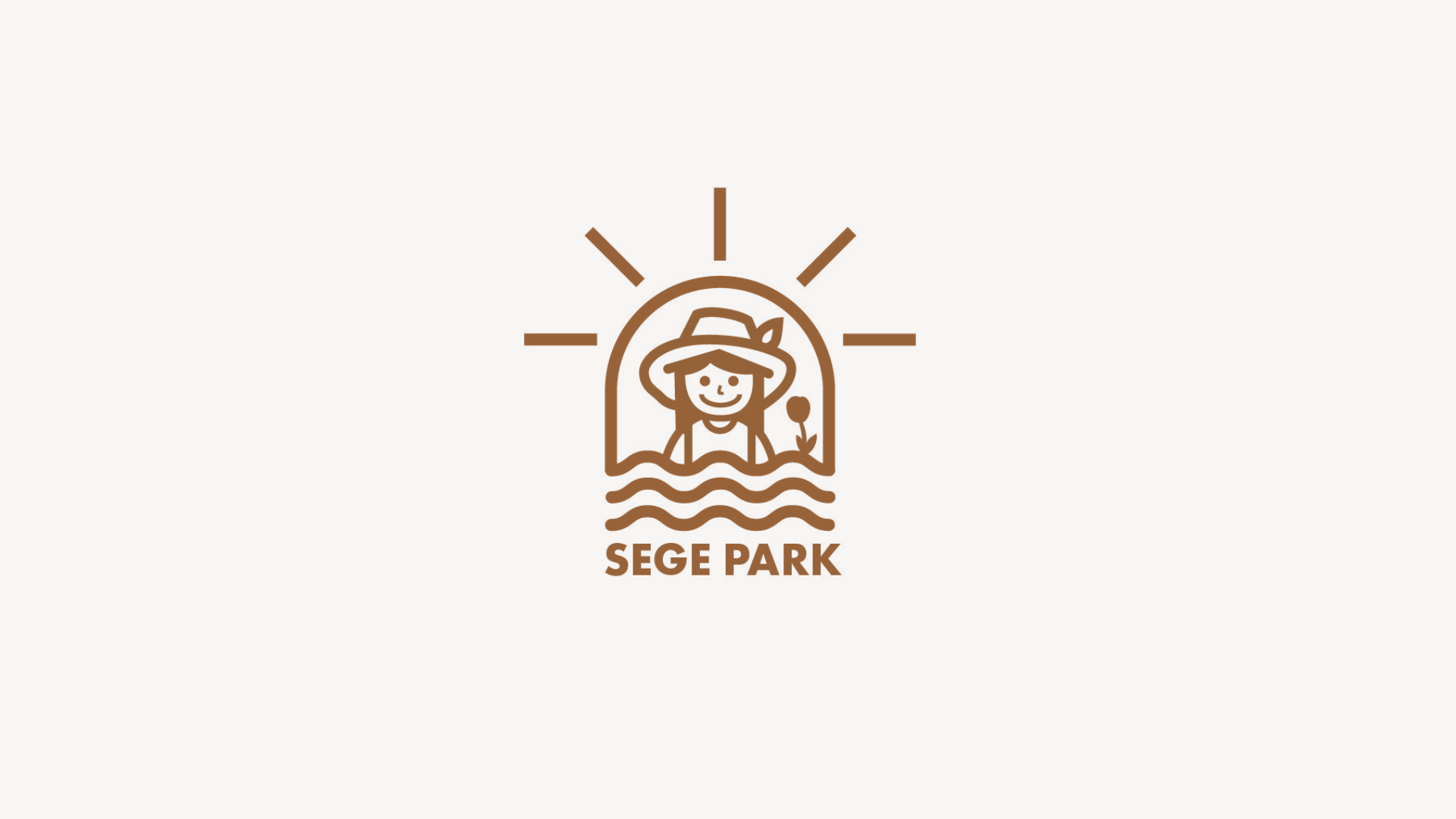
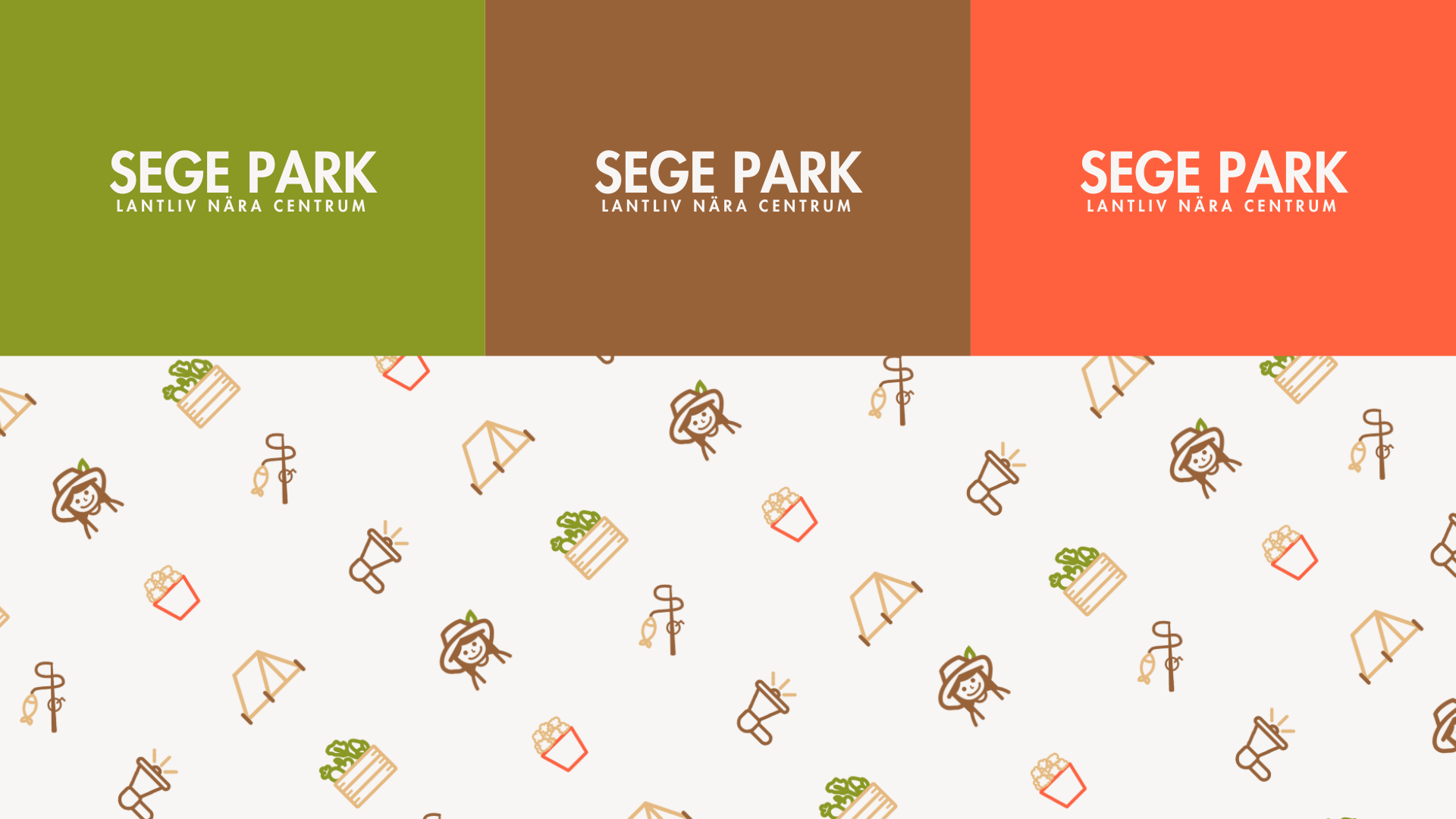
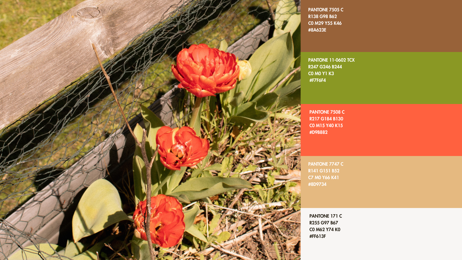
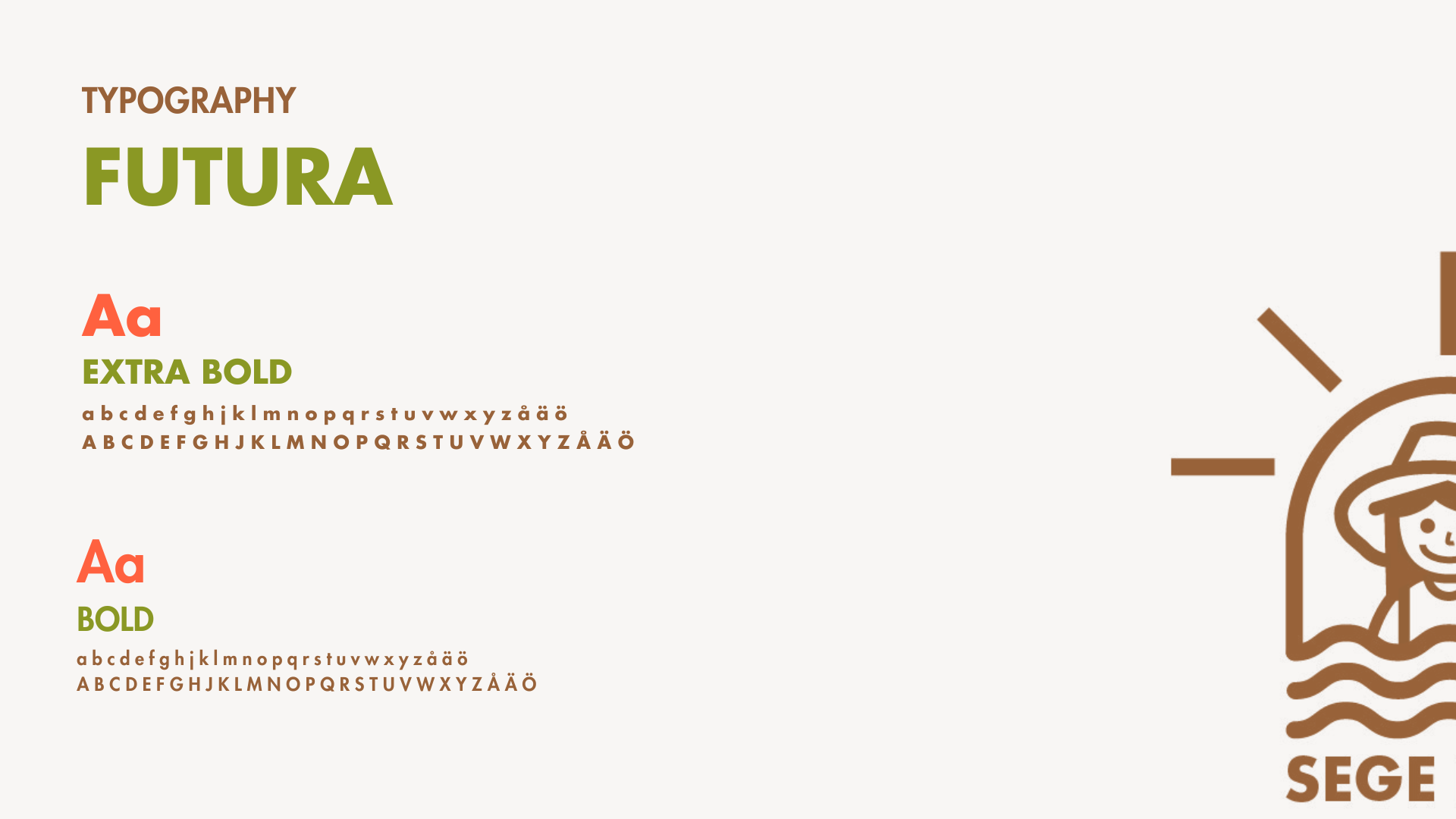
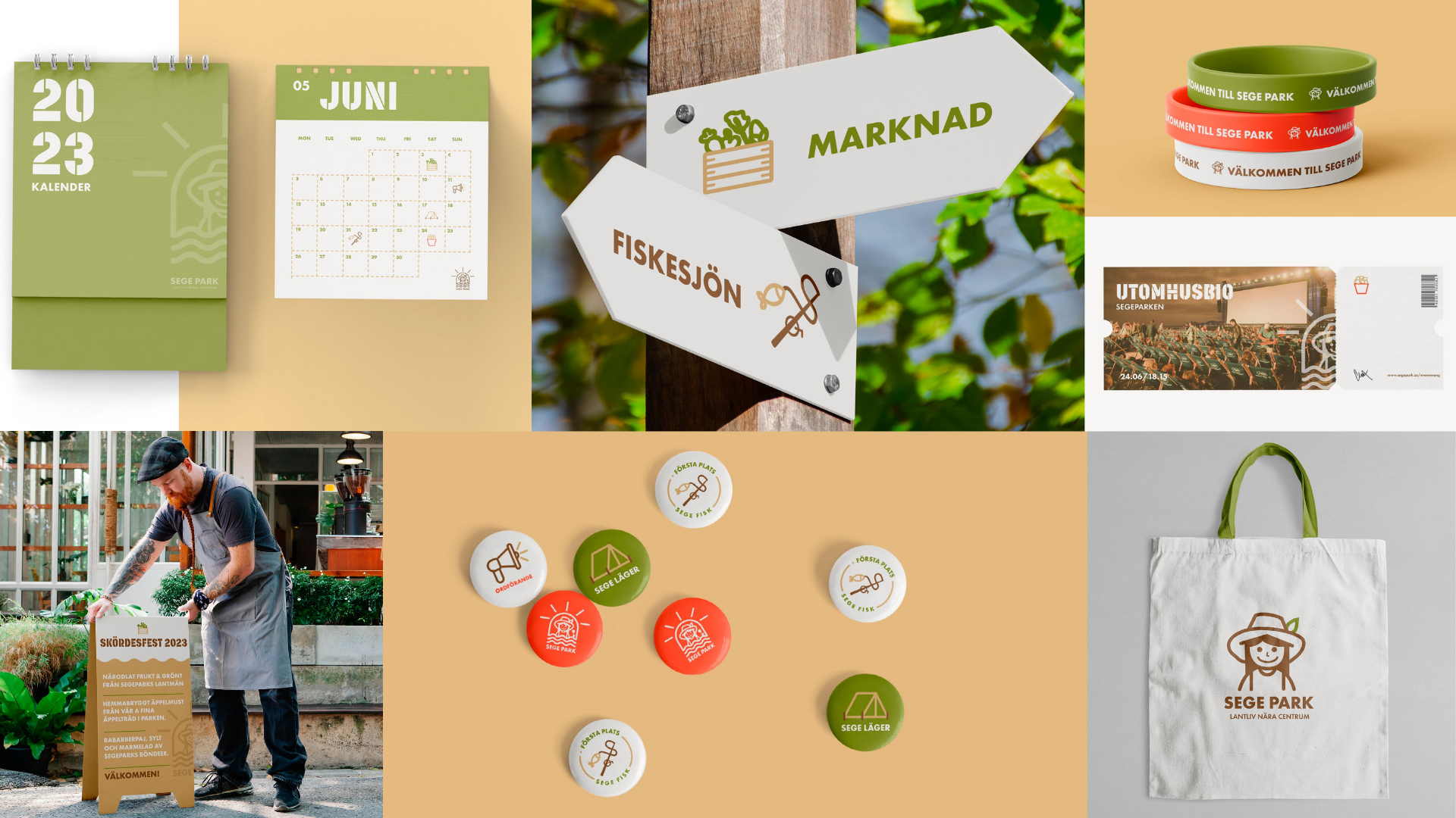
My branding project for Sege Park, Countryside Living Close to the City, drew inspiration from the district’s cultivation culture, which is both current and historically rooted. The aim was to convey the image of a farm with various events for the local residents, including families, children, and people with a love for greenery and agriculture. Events such as harvest festivals, fishing, outdoor cinema, and similar activities form the main strategy for reaching the target audience. A website and social media presence will further develop and strengthen the concept’s image. Elements like greenery, farming, sun, and water formed the foundation of the logo due to their essential roles in cultivation. Five earthy colors were selected from the site, including green, beige, brown, red, and dirty white.